
Picture yourself at a bustling farmers’ market. Stalls on either side, each vying for your attention. What makes you stop at one stand over the others? Maybe it’s the vibrant display of fresh produce, the friendly vendor waving you over, or the tantalizing aroma drifting your way.
Now, replace that experience in the market with your ecommerce website.
Would you prefer an ecommerce marketplace that feels chaotic, confusing, and leaves you scratching your head? Or one that’s sleek, inviting, and tells you exactly what’s on offer?
That’s where landing pages come into the picture.
Designed to convert potential shoppers, landing pages make your value proposition crystal clear, providing a way to generate more leads, boosting sales and conversions, and complimenting your overall marketing game.
What is an E-commerce Landing Page?
An ecommerce landing page is a specialized web page designed to guide visitors toward a specific action or conversion. Unlike a regular webpage, a landing page is focused on a single goal, such as making a purchase, filling out a form, or signing up for a newsletter.
These pages are strategically created to provide a clear and compelling message, minimizing distractions and encouraging visitors to take the desired action.
Whether it’s showcasing a new product, promoting a special offer, or capturing leads, an effective ecommerce landing page plays a crucial role in driving conversions and optimizing marketing efforts.
What Are The Elements of a Good E-Commerce Landing Page?
The essential components of a successful e-commerce landing page include:
1. A Main Headline and Supporting Headline:
- Your headline is the first impression you make, so it needs to be clear, concise, and grab attention.
- It should highlight the benefits of your product and pique the visitor’s interest in learning more.
- Use strong verbs and power words to create a sense of urgency or excitement.
2. High-Quality Images and Videos:
- People are visual creatures, so high-quality images and videos are essential for showcasing your products.
- Use professional-looking photos that are well-lit and show your products from different angles.
- If possible, include videos that demonstrate how your products work or the benefits they offer.
3. Compelling Product Description:
- Your product description should be clear, concise, and informative.
- Highlight the key features and benefits of your product, and focus on what makes it unique.
- Use bullet points and short paragraphs to make the text easy to read.
4. Strong Call to Action (CTA):
- Your CTA is what tells visitors what you want them to do next, whether it’s adding an item to their cart, signing up for your email list, or making a purchase.
- Make your CTA clear, concise, and easy to find.
- Use strong verbs and contrasting colors to make it stand out.
The best e-commerce landing pages have in them some additional components, such as:
5. Social Proof:
- Social proof shows potential customers that other people trust and buy from your brand.
- Include customer testimonials, reviews, and logos of well-known companies that use your products.
6. Mobile-Friendly Design:
- More and more people are shopping on their mobile devices, so it’s essential to make sure your landing page is mobile-friendly.
- Use a responsive design that looks good and functions well on all devices.
7. Trust Signals:
- Trust signals show potential customers that your website is safe and secure.
- Include clear and concise information about your return policy, shipping costs, and privacy policy.
- Use secure payment methods and display security badges.
8. Limited-Time Offers:
- Limited-time offers can create a sense of urgency and encourage visitors to take action.
- Offer discounts, free shipping, or other incentives for a limited time only.
How is an E-commerce Landing Page Different from a Product Page?
E-commerce landing pages and product pages serve distinct purposes in the online shopping experience. Here are the key differences between them:
1. Objective:
E-commerce Landing Page: The primary goal is to capture the visitor’s attention, create interest, and guide them towards a specific action, such as making a purchase, signing up, or exploring product categories.
Product Page: Focuses on providing detailed information about a specific product, including its features, specifications, pricing, and options, with the aim of facilitating a purchase decision.
2. Scope:
E-commerce Landing Page: Typically covers a broader scope, introducing the brand, promoting special offers, or directing users to specific sections of the website.
Product Page: Narrowly focuses on a particular product or product category, offering in-depth details to aid potential buyers.
3. Content Depth:
E-commerce Landing Page: Contains concise and persuasive content, emphasizing the brand’s unique selling propositions, value propositions, and overarching benefits.
Product Page: Features detailed and specific content related to a single product, including descriptions, specifications, images, and customer reviews.
4. Call-to-Action (CTA):
E-commerce Landing Page: Prominently displays a general call-to-action that encourages visitors to take a desired action, such as exploring collections, signing up, or claiming an offer.
Product Page: Highlights a product-specific CTA, typically guiding users to “Add to Cart,” “Buy Now,” or a similar action directly related to the product.
5. Navigation:
E-commerce Landing Page: May have limited navigation options to maintain focus on the primary CTA and prevent distractions.
Product Page: Often includes navigation elements allowing users to explore related products, view categories, or access the shopping cart.
6. Target Audience:
E-commerce Landing Page: Targets a broader audience, including new visitors, by providing a snapshot of the brand and its offerings.
Product Page: Primarily caters to users who have already expressed interest by navigating to a specific product, focusing on converting them into customers.
6. Design Elements:
E-commerce Landing Page: Incorporates visually appealing elements, impactful imagery, and concise content to create a compelling first impression and encourage exploration.
Product Page: Emphasizes product images, detailed descriptions, and specifications to provide a comprehensive overview, aiding in the purchasing decision.
7. Conversion Funnel Stage:
E-commerce Landing Page: Often serves at the top or middle of the conversion funnel, aiming to generate awareness, interest, and consideration.
Product Page: Sits toward the bottom of the funnel, focusing on converting interested prospects into customers.
Common Types of E-commerce Landing Pages
E-commerce landing pages can vary based on their specific goals and content. While the possibilities are extensive, here are some common types of e-commerce landing pages:
1. Abandoned Cart Recovery Pages
Abandoned Cart Recovery Pages play a crucial role in e-commerce by addressing a common challenge: potential customers adding items to their cart but not completing the purchase.
These dedicated pages are designed to re-engage and convert visitors who have abandoned their shopping carts.
2. Event or Seasonal Pages
Event or Seasonal Pages in e-commerce are dedicated sections of a website designed to align with specific occasions, holidays, or seasons.
These pages serve as dynamic showcases, adapting the online shopping experience to match the festive spirit or thematic focus associated with a particular event or time of year.
3. Limited-Time Offer Pages
Limited-Time Offer Pages in e-commerce are dynamic sections strategically crafted to showcase exclusive promotions, discounts, or special deals available for a brief duration.
These types of landing pages are designed to evoke a sense of urgency, prompting visitors to act quickly and take advantage of the time-sensitive opportunities presented.
4. Coming Soon or Pre-Launch Pages
Coming Soon or Pre-Launch Pages in e-commerce are strategically designed placeholders that generate anticipation and excitement for upcoming products, collections, or features.
They serve as teasers, offering a sneak peek into what’s on the horizon and encouraging visitors to stay connected for the grand reveal.
5. E-commerce Ads Landing Pages
When users search for a specific brand on Google, they are often presented with a mix of organic search results and paid advertisements.
Take Macy’s for example.
When comparing the ads and organic search results for a brand like Macy’s, the subtle differences in their ad content become apparent.
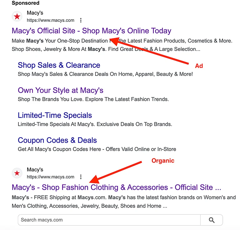
The e-commerce ads landing pages associated with paid advertisements often feature more targeted messaging, specific promotions, or tailored offers compared to the homepage.
Best Practices For Your E-commerce Landing Pages
Crafting effective landing pages for your e-commerce demands a blend of creativity, strategy, and user-centric design.
While each landing page may cater to distinct campaigns, customer segments, or sales funnels, several proven best practices consistently enhance their impact.
Here are five best practices:
1. Simplify and Declutter:
- A stellar landing page is clean, concise, and easy to navigate. This entails decluttering your page to prevent visitors from feeling overwhelmed.
- Implement concise, to-the-point headlines that quickly convey your message.
- Ensure a visible and clear Call-to-Action (CTA) to guide visitors seamlessly.
- Remove distracting site navigation links, keeping the focus on the conversion goal.
- Incorporate relevant, high-quality images and use bullet points for streamlined product details.
- Opt for a clutter-free layout to prevent potential customers from bouncing due to information overload.
2. Prominent and Singular CTA:
- Grab visitors’ attention by incorporating a prominent and singular CTA.
- Limit your landing page to one CTA, streamlining the decision-making process for users.
- Place the CTA strategically at the top of the page, above the digital fold.
- Consider using active voice for button text to prompt action (e.g., “Sign up for Free”).
- Create a sense of urgency or exclusivity in your CTA to encourage immediate action.
- Regularly test different CTA elements, including text, placement, and color, to optimize for conversions.
3. Harness the Power of High-Quality Images:
- Optimize your limited space by incorporating compelling, high-quality images.
- Tailor images to align with the landing page’s objectives; for mid-funnel campaigns, use relevant product images.
- Ensure images are optimized for all devices, particularly mobile, to accommodate diverse user preferences.
- Leverage images for social proof by including customer testimonials with photos, user-generated content, media recognition, or endorsements with celebrity images.
- Images not only enhance visual appeal but also contribute to building trust and credibility.
- Only use images that complement your landing page, avoiding low-quality or irrelevant visuals.
4. Include Product Videos:
- Integrate videos strategically to enhance user engagement.
- Use videos to provide product demonstrations, highlight features, or share compelling brand stories.
- Ensure videos are easily accessible and optimized for quick loading to prevent user frustration.
- Leverage videos to convey information in a visually appealing and concise manner, complementing other content elements.
5. Embrace Shoppable Videos:
- Improve the user experience by incorporating shoppable videos directly on your landing page.
- Enable users to interact with products showcased in the video, creating a seamless transition from inspiration to purchase.
- Implement clear CTAs within the video, allowing viewers to make a purchase or explore more details effortlessly.
- Leverage shoppable videos for product launches, seasonal campaigns, or highlighting featured items, adding an interactive and dynamic element to your landing pages.
5 Examples of High Converting Ecommerce Landing Pages
Creating the perfect e-commerce landing page isn’t always straightforward or one-size-fits-all. It’s always a good idea to experiment and see what resonates with your visitors.
If you’re looking for ideas to get started, check out these 3 examples of effective e-commerce landing pages for some inspiration.
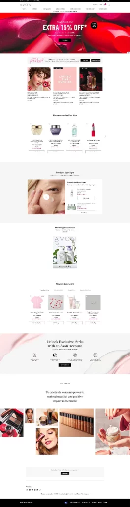
1. Avon
The Avon landing page has a clean and visually appealing design, with a clear focus on promoting their Valentine’s Day Shop and the extra 15% off offer.
Here are some good things about the landing page:
- Visually appealing design
- Clear promotion of the Valentine’s Day Shop
- Prominent display of the extra 15% off offer at the top of the page
- Use of a limited-time discount code to incentivize purchases
- Product spotlight to feature popular items and showcase their unique benefits and features.
- Recommended products section.
- Clean menu at the header.
- Easy navigation.
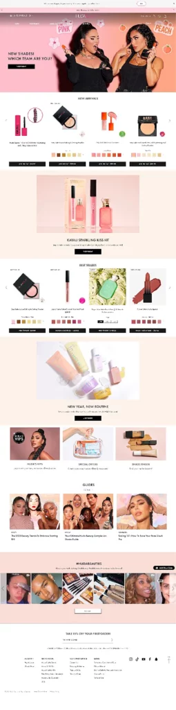
2. Huda Beauty
The landing page of Huda Beauty features an attractive design that highlights new arrivals, best sellers, and guides.
Here ‘s what we like about their landing page:
- New arrivals section with product variations
- Prominent product promotion with a “shop now” call-to-action
- Best sellers section highlighting popular products
- Color palette to tell buyers those products are available in multiple shades.
- A small section featuring product guides.
- Inclusion of user-generated content section for customer engagement and brand promotion
- The email collection section at the bottom of the page offers a 15% discount for users who sign up, incentivizing visitors to subscribe to the newsletter and make a purchase, while also building an email list for future marketing efforts.
3. Lululemon
Lululemon‘s landing page isn’t just aesthetically pleasing; it’s a conversion powerhouse. Let’s dissect its key elements and uncover the lessons we can apply to our own landing pages:
- Clear and concise headline that avoids confusion and directs users.
- Clean search bar encourages targeted browsing and immediate product discovery.
- Minimalist design. Uncluttered and intuitive, focusing on key categories.
- Targeted recommendations. Personalized suggestions based on browsing history.
- Community hub. Blog posts and events foster brand connection and engagement.
- Social proof. Customer testimonials and influencer collaborations build trust.


